


ABOUT THE PROJECT
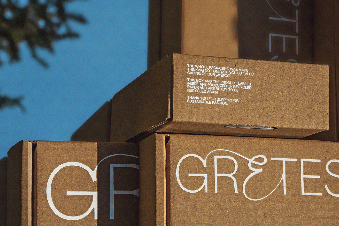
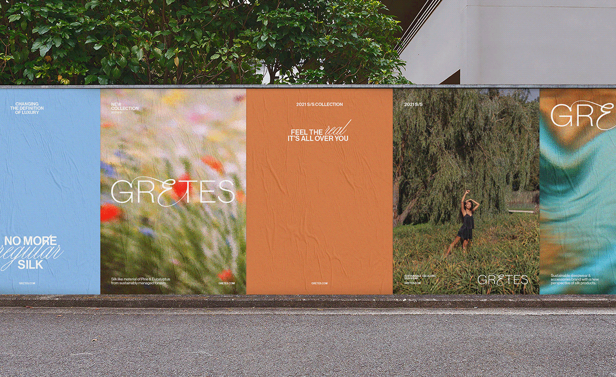
Gretes is a sustainable sleepwear brand that decided to glance into a new perspective of silk products: a sleep dress, nightshirt, bralette or turban — each is made from sustainably managed pine and eucalyptus forests, leaving Gretes on top of other modern brands that no longer can afford to be luxurious only because of their quality or history.
CLIENT NEEDS
As Gretes decided to change its material — natural silk — and focus on making Gretes a sustainable version of silk out of plants, one obstacle occurred. The brand needed to find a way of preserving its previous customers that loved traditional silk yet bringing the new clientele that sought to keep up with fashion that is one with nature. Hence, a sweet spot to communicate the balance between those two audiences was crucial.
DESIGN VALUE
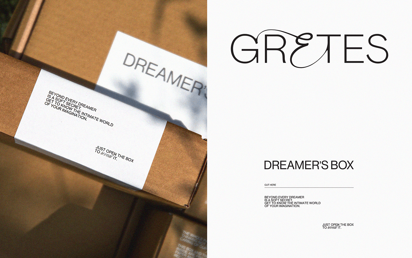
Since the brand is all about sleepwear, we naturally compare it to the night dream. But when thinking about it from the new perspective, from now, Gretes is an endless, comfortable and nature-inspired dreaming throughout the whole day.
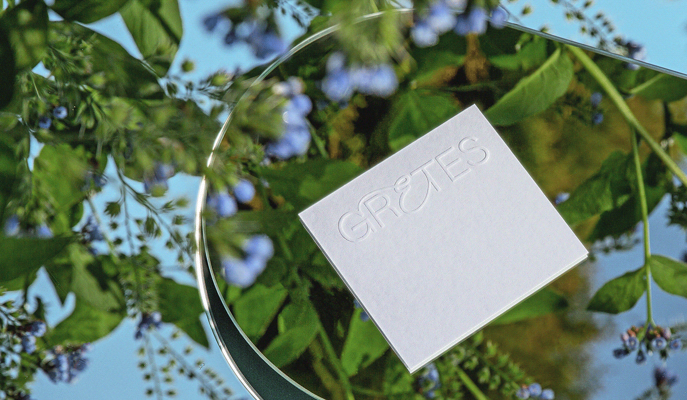
When starting this direction, we thought of combining modern and innovative approaches with traditional luxury. In typography, modernity is portrayed with a very straightforward Grotesk Sans Serif, while archaic luxury is depicted in Script font that mimics handwriting from royal documents and letters. The photography style and colours are all about that sweet, simple and innocent feeling, which hides imagination that is often expressed by more profound means of sensuality.
DELIVERABLEs: BRANDING SYSTEM / COMMUNICATION DESIGN / packaging / art direction
-
2021 © &ANDSTUDIO


CASE PHOTOS: MARTYNA PAUKSTE


